
About
Mercado Pago helps people and small businesses access loans when traditional banks reject them, so confusion about how early payment works can directly impact their cash flow and trust in the product.
Defining the problem
How might we decrease the contact rate due to a lack of understanding of the early payment flow?
“
Goals
BUSINESS GOALS
Reduce the contact rate (tickets, calls, chats) related to doubts and complaints about how early payment operates.
USER GOALS
Improving payment experience and NPS.
Help users feel informed and in control when prepaying installments.
Problem Statement
Given the broader scope and development constraints, the first release focused on copy, onboarding, and the critical steps in the flow, while laying groundwork for deeper changes to admin and backend systems
This better fits their mental model of “which payments
am I moving forward?” and helps them see the impact of each choice.
UX Challenges in the Existing Flow
PROBLEM #1
Friction right after intent
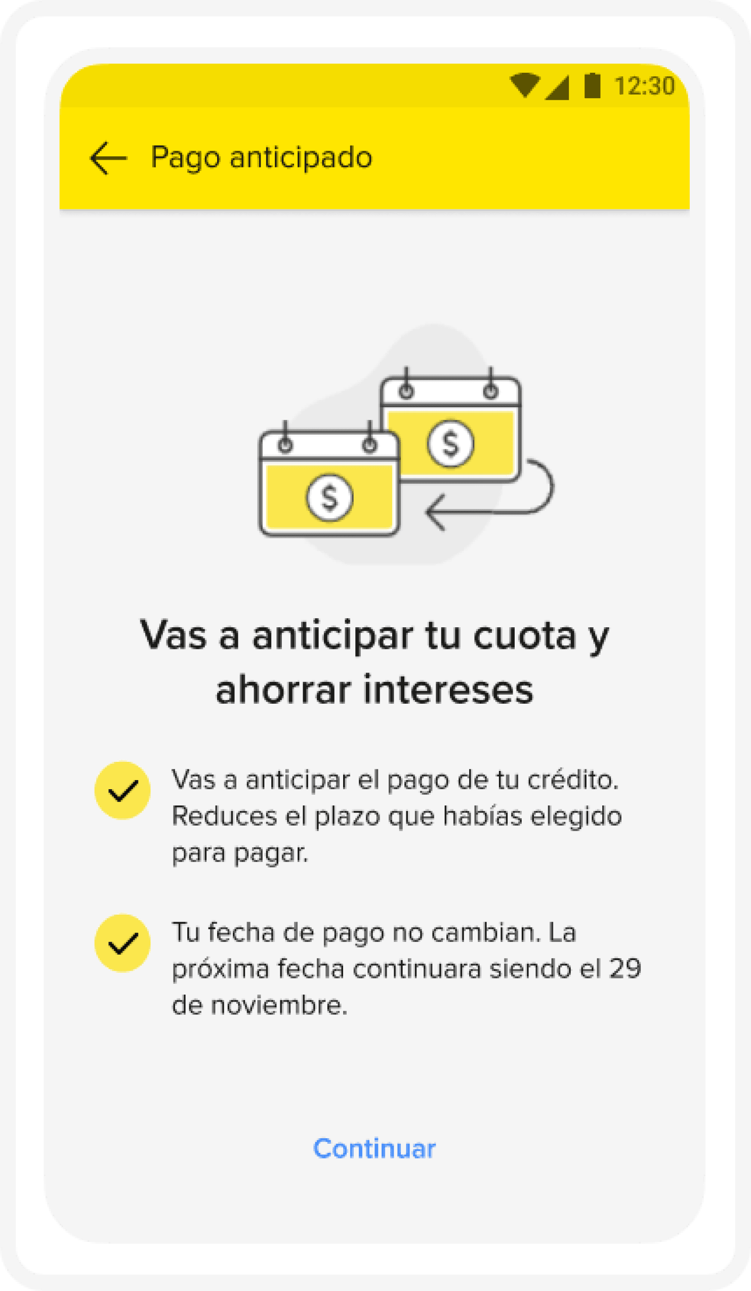
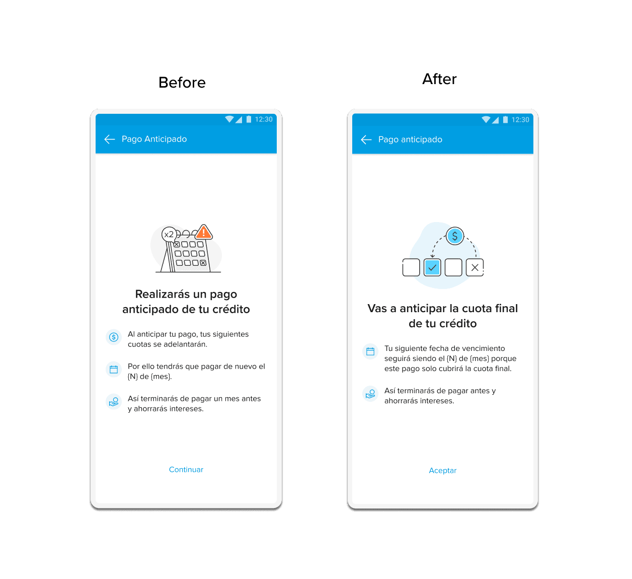
Right after tapping the payment button, users hit a full‑screen onboarding that tries to explain the entire prepayment concept at once.
IMPACT
Instead of feeling helpful, this “brake screen” interrupts the sense of immediacy and feels like a barrier, especially when users just want to pay and move on.
EXAMPLE
In this case, it acts as a brake that limits having an all-in-one screen and does not bring information through the process. Breaks the effect of immediacy.
Most of the explanation about how prepayment works lives only in this initial onboarding.
Because users scan and often dismiss this screen, they start the flow without having understood the key rules about dates and interest.
PROBLEM #2
Critical information in the
wrong place
IMPACT
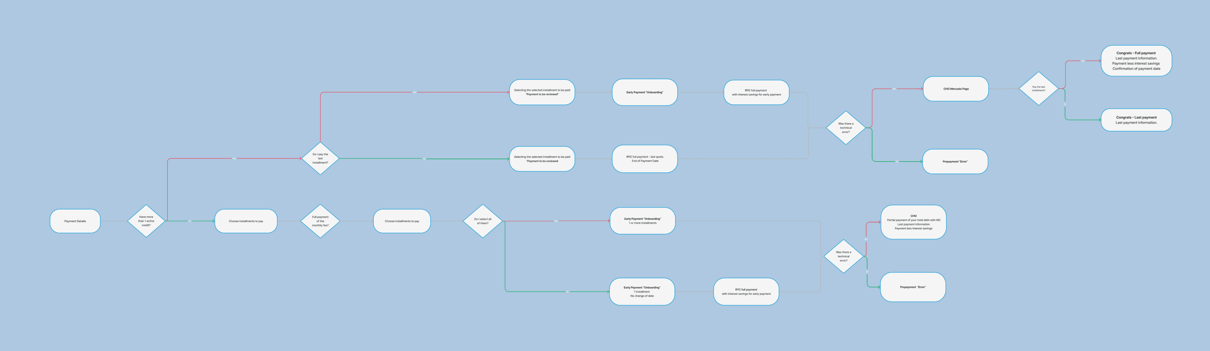
The interface exposes essentially one visible path for early payment, regardless of how the user actually wants to prepay. This makes it hard to compare options or decide which installments to advance, reinforcing the misconception that prepaying “skips a month” rather than recalculating amounts and dates.
PROBLEM #3
Only one visible joruney
IMPACT
Fresh Start Effect
Decrease contact rate about prepayment by around 23%.
Increase payment‑related NPS and UX metrics after the redesign.
Because this was part of a larger platform effort, the first iteration focused on redesigning the onboarding and key parts of the flow, so development could implement changes incrementally.
What this means
Users scan interfaces, so putting all critical explanations in a dense onboarding screen guarantees many will miss them.
The main confusion is not “what is prepayment?” but “what happens to my next due date and amount if I prepay today?”.
When people deal with debt and interest, they are more sensitive to cognitive load: too much information at once quickly becomes overwhelming and hurts trust.
Behind these data points there are real stories: some customers tried to prepay to save money but left the flow unsure whether they would still be charged the following month, and ended up contacting support.
The high‑level objective was to redesign the prepayment flow so that users see, step by step, how paying early changes their installments, and can choose confidently how to proceed. The solution sought to be scalable for both the visual layer and the underlying payment path.
Because this was part of a larger platform effort, the first iteration focused on redesigning the onboarding and key parts of the flow, so development could implement changes incrementally.
To make a big impact, we reworked the entire user flow.
These issues are also examples of Hick’s Law and high cognitive load: too many concepts and decisions thrown at users at once, in the wrong moment and format for a financial decision.
This directly addresses the earlier misconception that paying early “skips a month” and replaces it with a transparent before/after view.
Success metrics
Reduce contact rate about prepayment doubts by around 23% through clearer explanations and summaries.
Improve UX metrics and payment‑related NPS by making users feel more informed and in control.
Strengthen storytelling within the product itself by using visuals and step‑by‑step guidance instead of dense text blocks.
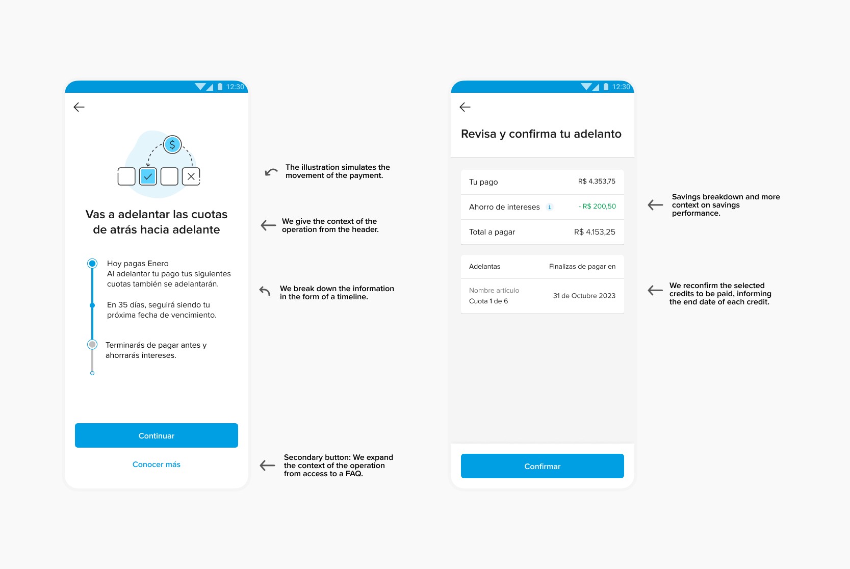
Distribute explanations about interest savings and date changes along several steps, in smaller, contextual chunks.
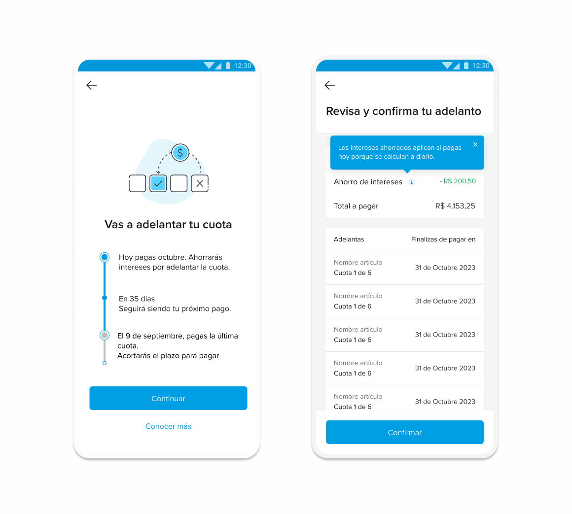
Let users manually select which installment(s) they want to advance, from back to front.
Usability tests on the redesigned flow showed that many users still did not read every word, but they now understood the core mechanics better because the most important information appeared at the right moment, in the right place.
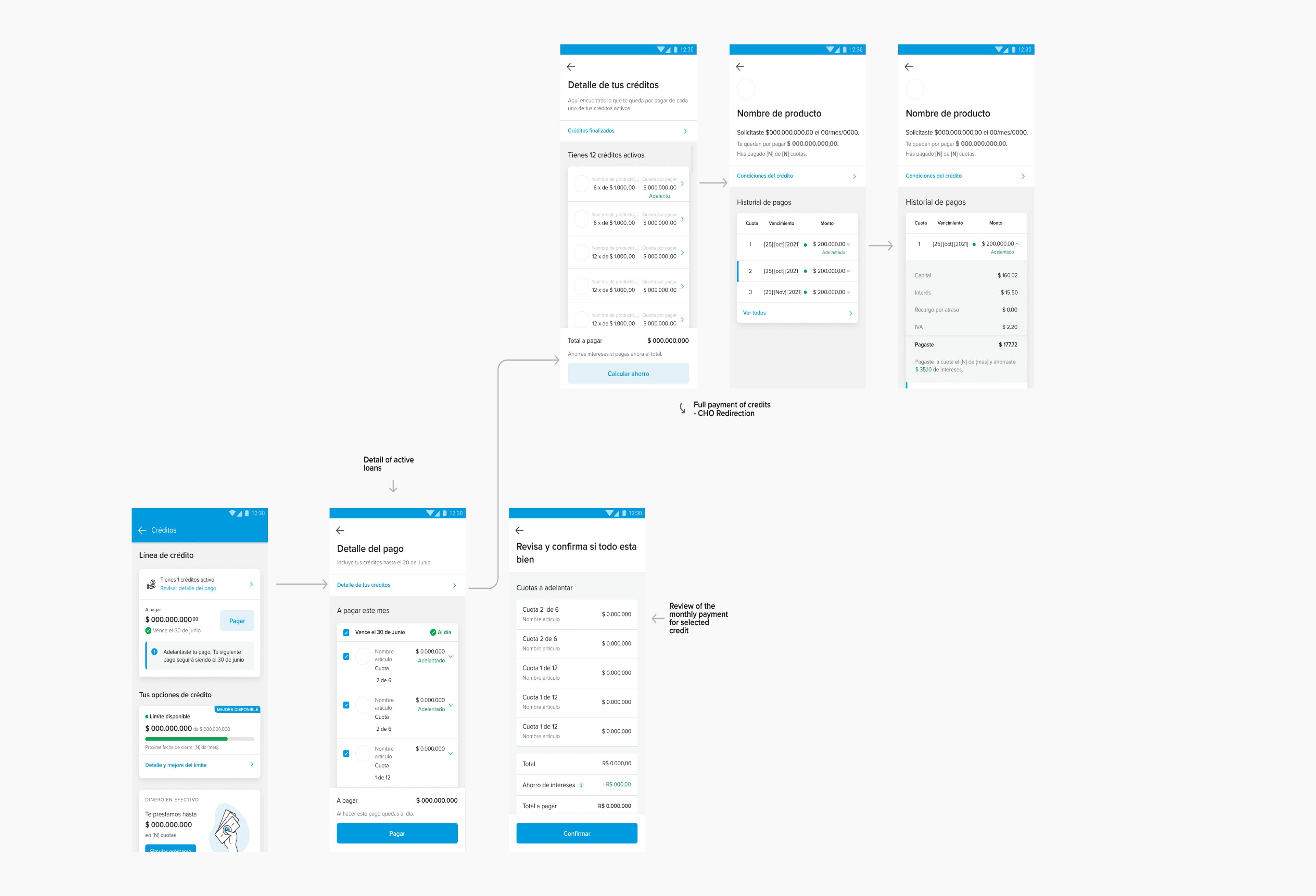
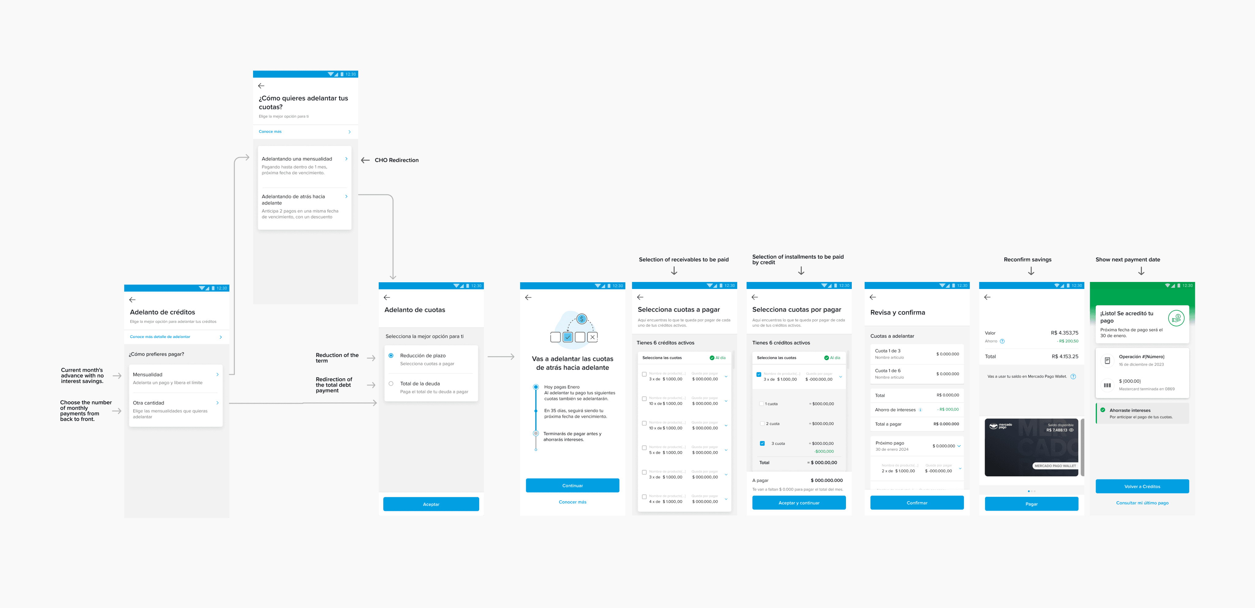
Manual selection of installments
Allow users to choose explicitly whether they want to prepay or continue with regular monthly payment.
This clarifies that prepayment is a choice, not an unexpected change in their normal behavior.
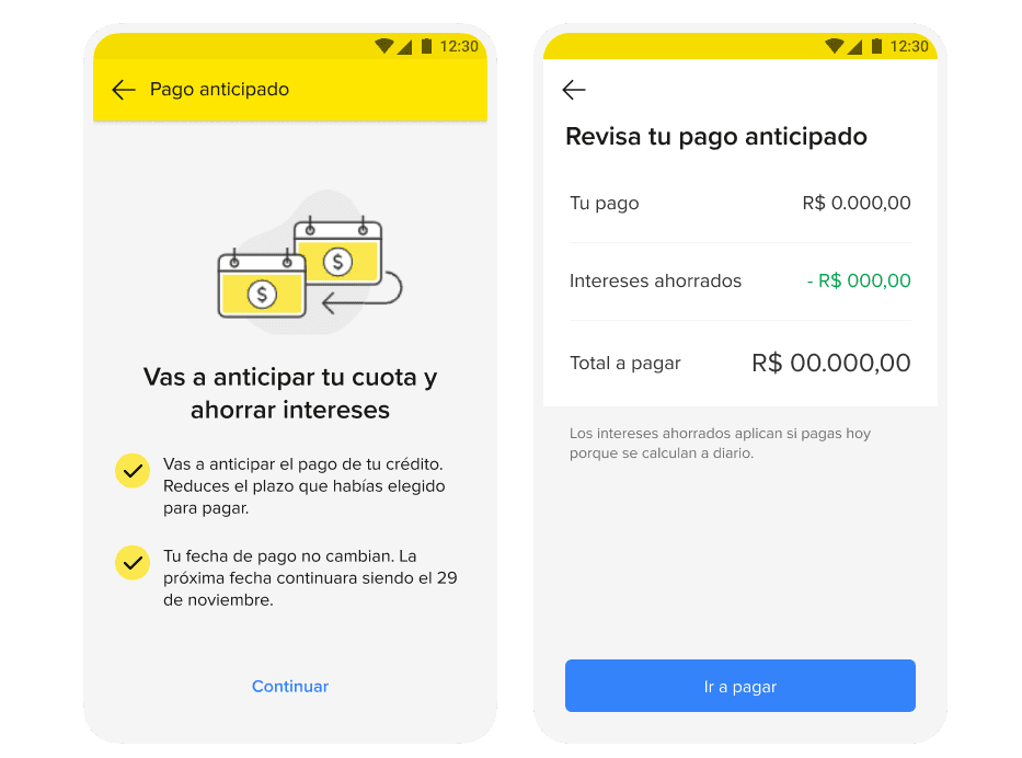
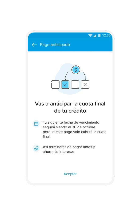
Add a final confirmation screen summarizing
Clear confirmation and summary
How much they are paying now.
How much interest they are saving.
What their new next due date and amount will be
Impact and Next Steps
Working on early payment for Mercado Crédito highlighted several lessons about communication, risk and collaboration in fintech environments.
Communication is part of the product
Clear, aligned communication between product, design, content and stakeholders is essential when dealing with money and regulations; copy and flows alone cannot fix misaligned expectations.
Hypotheses before shipping
When data is missing, it is better to make assumptions explicit and validate them step by step than to iterate blindly in production.
Designing within constraints
Technical and regulatory constraints forced prioritization of low‑effort, high‑impact improvements (copy, onboarding, flow steps) that could ship quickly while still moving the needle.
Mapping edge cases builds trust
Validating the new user flow against multiple scenarios and “what if” cases helped prevent surprises for users and reduced the risk of future support tickets.
Collaboration amplifies solutions
Workshops and design critiques with the team broadened the range of ideas and led to a solution that balanced user clarity, business goals, and implementation cost.
Collaboration amplifies solutions
Decrease contact rate about prepayment by around 23%.
Increase payment‑related NPS and UX metrics to 3% after the redesign.
Research and Key Insights
Identifying user needs
Before designing, usability tests and product data were used to understand how people currently interact with prepayment.
What we observed
1 of 5 Users clearly understood how early payment works and found the information clear.
4 of 5 Users did not read all the content; they scanned the screens and missed important details.
5 of 5 Users understood that prepayment helps them save interest, but many believed that if they paid in advance they would “skip a month” and pay again one month later.
3 of 5 Users assumed the interest savings calculation was fixed, when in reality it varies depending on the exact payment date.
Redesigning early payment to increase NPS
Timeline
May 2023 — July 2023
PLATFORM
iOS & Android
MY ROLE
Product Designer