
Diseño de un SaaS de Gestión para de datos de agua
Cronología
Junio — Agosto 2021
PLATAFORMA
Aplicación para iOS y Android
MI ROL
Product Designer
Es una de las tres compañías mineras más grandes del mundo con operaciones de cobre, zinc, hierro y carbón térmico en Chile. Hoy, se compromete a cumplir con los estándares en sus procesos para el manejo responsable de los recursos hídricos, reduciendo así el impacto en el medio ambiente al enfrentar el cambio climático.
El propósito era implementar un sistema de monitoreo en tiempo real del consumo de agua para los lugares definidos por la empresa, utilizando los sensores e instrumentación desplegados en el campo como base.
Acerca de BHP
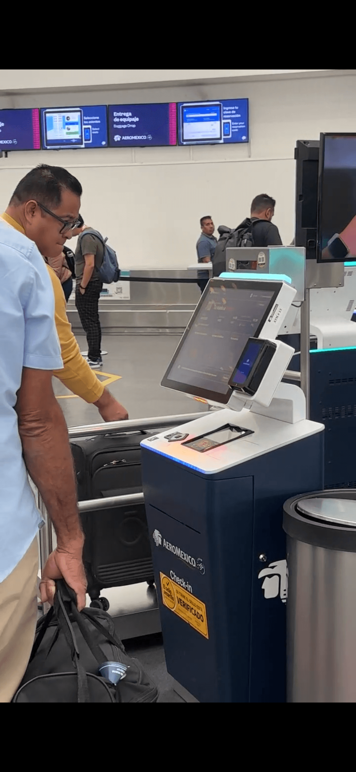
The check-in kiosk at Aeroméxico airports had 15 steps, an average baggage drop time of 10 minutes, and error messages with no actionable guidance leaving passengers stranded at the worst possible moment of their journey.
After a full customer journey audit spanning Planning, Booking, Check-in and Day of Travel, I was brought in as Product Designer to simplify the core check-in flow: fewer steps, less friction, and a baggage drop experience that passengers could complete in under 2 minutes.
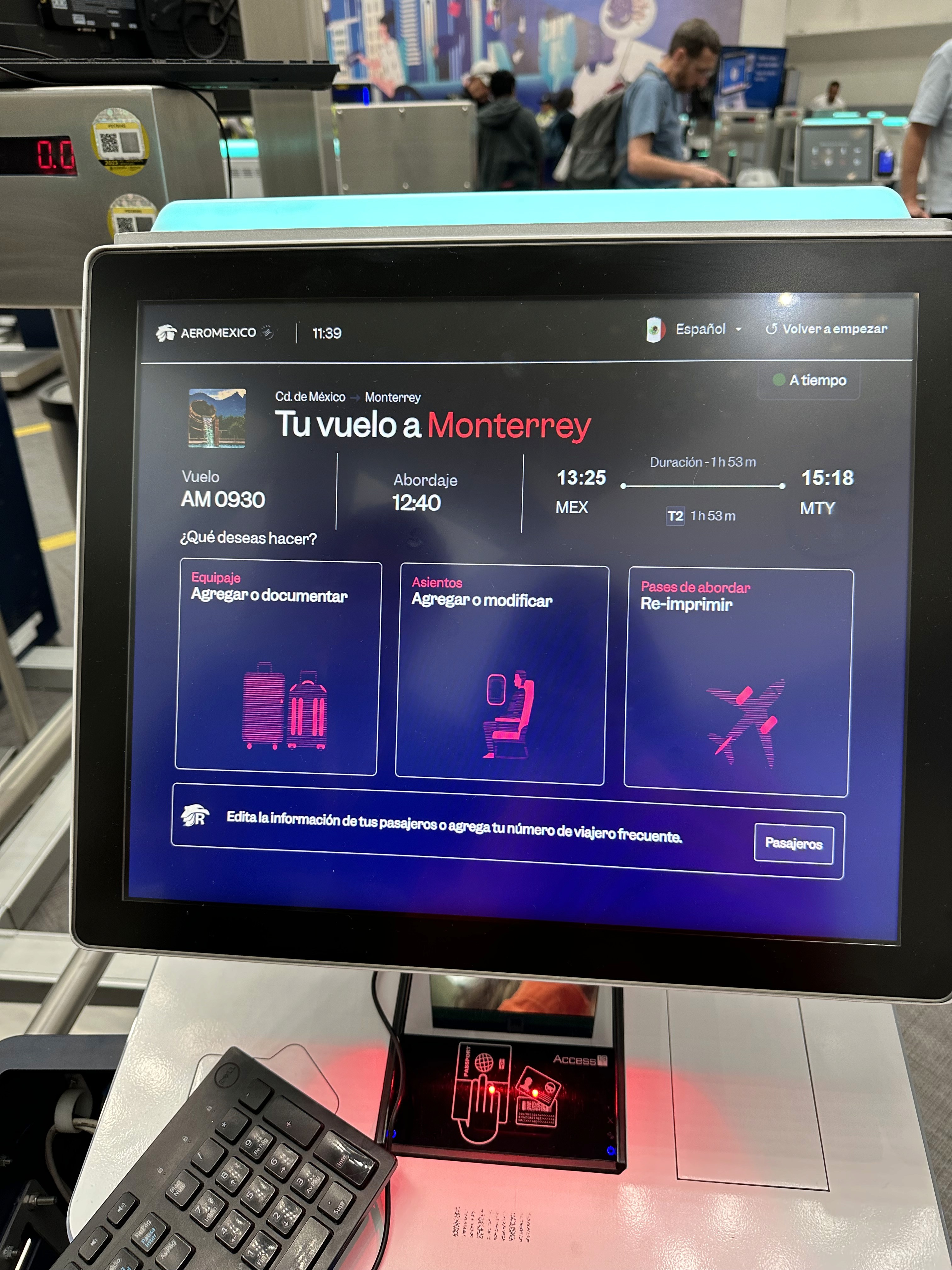
15 → 6 steps
Domestic flow reduced to 2 steps
CES 3.8 → 4.6
Above internal satisfaction bench
-30% TTV
Baggage drop avg
10 min → 7 min
Desarrollar este proyecto fue muy desafiante y complejo, entender la lógica y cada detalle del sistema en su lugar en la mina para gestionar los datos del agua. Por otro lado, tuvimos que cuestionar y repensar nuestra forma de trabajar sin tener acceso a los usuarios, por lo que fue un proceso no lineal que requirió adaptabilidad y mucha organización con el equipo interno y externo. Por un lado, fue un proceso no lineal, para innovar el proceso de investigación. Requirió adaptabilidad y mucha organización con otros equipos, fue muy desafiante y complejo, entender la lógica y cada detalle del sistema en su lugar en la mina para gestionar los datos del agua. La priorización y la arquitectura de la información fueron significativas en la representación de datos. En este desafío, mis habilidades comerciales con los clientes y el uso de la metodología scrum se fortalecieron enormemente.
La comunicación, la organización y la negociación fueron cruciales para abordar este desafío de la mejor manera posible, poniendo en práctica nuestras habilidades blandas y técnicas, para dar valor a nuestro trabajo como UX.
Trabajamos en una propuesta que forma parte de los estándares requeridos por la empresa y puede ser iterada e implementada por el equipo de BHP.
La forma de trabajar y entender que "el orden de los factores no altera el producto", porque siempre tuvimos al usuario en mente como centro del diseño.
Me hubiera gustado cubrir más flujos, como preguntarle directamente al usuario qué cubre el flujo de administración, donde el super usuario podría asignar roles y permisos a las diferentes entidades que colaboran en la plataforma, esto implicaba más tiempo trabajando junto con el equipo de BHP, aún así, hacerlo visible y proponerlo como futuros accionables si continuamos desarrollando este proyecto.
Priorización de características
Average baggage drop time went from 10 minutes to 7 minutes, freeing up throughput at peak hours without adding hardware.
TTV dropped 30%
More passengers completed check-in independently at the kiosk, reducing pressure on human agents during boarding windows.
Digital share grew 75%
Designing for a kiosk taught me something I hadn't fully internalized before: the context of use changes everything. The same user who navigates a complex app calmly at home will need literal, explicit instructions on a shared terminal when they're running late for a flight. Stress collapses tolerance for ambiguity. The most important design decision on this project wasn't visual — it was the choice to prioritize clarity simplification over elegance in every instruction screen.
Include users with visual impairments from the first round of research, not as a post-launch iteration. Accessibility considerations surfaced late and required a separate design pass.
Push earlier for a SABRE API update to remove the 5-passenger constraint at the source. The backend workaround works, but it creates invisible technical debt for future iterations.
Define a shared error taxonomy with the engineering team from week one. Generic error messages ("An error occurred") were the most cited pain point in user research — and the last thing we fixed.
What I'd do differently:
Extend the simplified flow to the Aeroméxico mobile app, standardize the experience, applying the same "literal text" principle to the mobile check-in experience.
Explore proactive notifications that pre-fill passenger data before travelers reach the kiosk, reducing the first 2 steps entirely.
What's next
en comparación con la página de inicio ya que estamos atendiendo diferentes casos de uso.
Dueño de los datos
Una gran frustración es tener que revisar los informes y
que la información no esté capturada correctamente.
Propuesta de valor
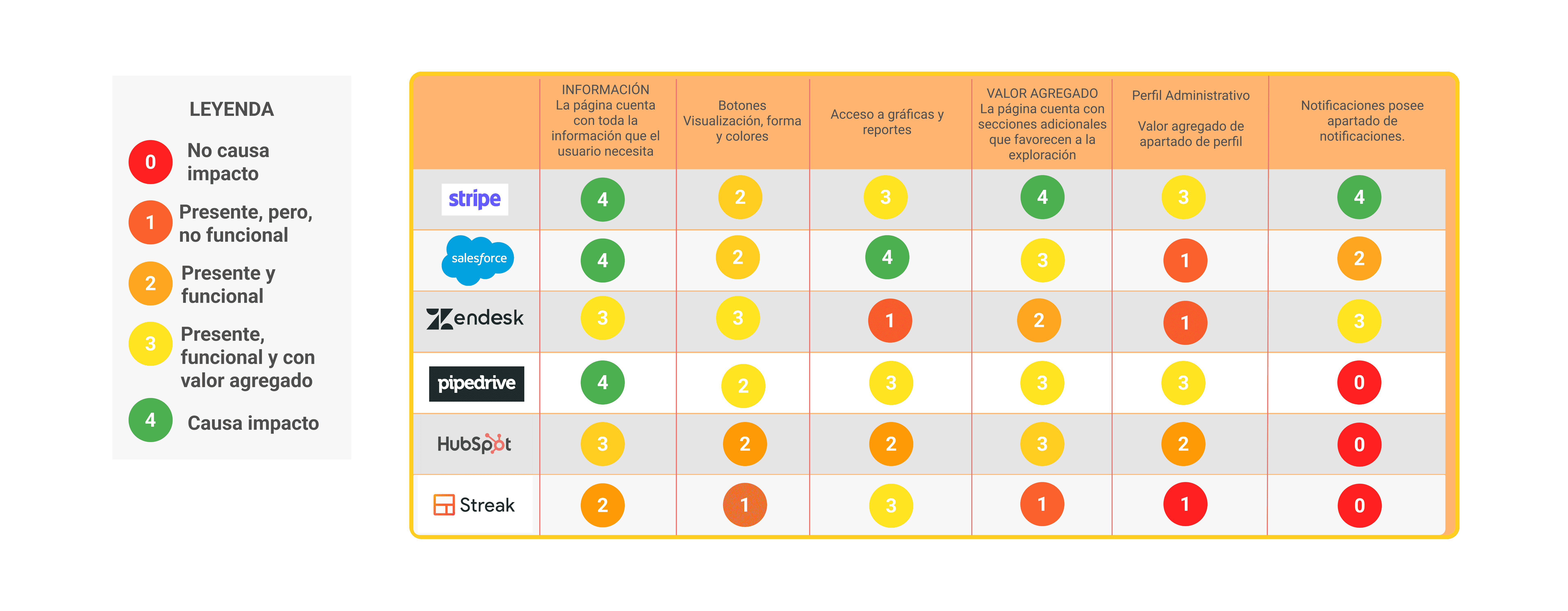
Para comprender mejor las prácticas, se realizó un benchmark de diferentes CRMs, y los elementos mínimos necesarios para poder trabajar en la plataforma MVP. Los puntos más fuertes que dicho Dashboard completo debe tener y que eran necesarios identificar.
Paint Points detected
Unclear validations when capturing reservation data.
Long reservation times.
Generic error messages (“An error occurred”) without guidance on what to do.
Why we tackled document scanning first not the full flow
After field research, it became clear that 70% of friction happened during document scanning not during seat selection or fare review.
Rather than redesigning the entire 15-step flow at once, we prioritized that micro-moment first, validated it, and then restructured the surrounding flow around it. This reduced risk and let us ship faster.
The SABRE constraint and the 5 passenger limit.
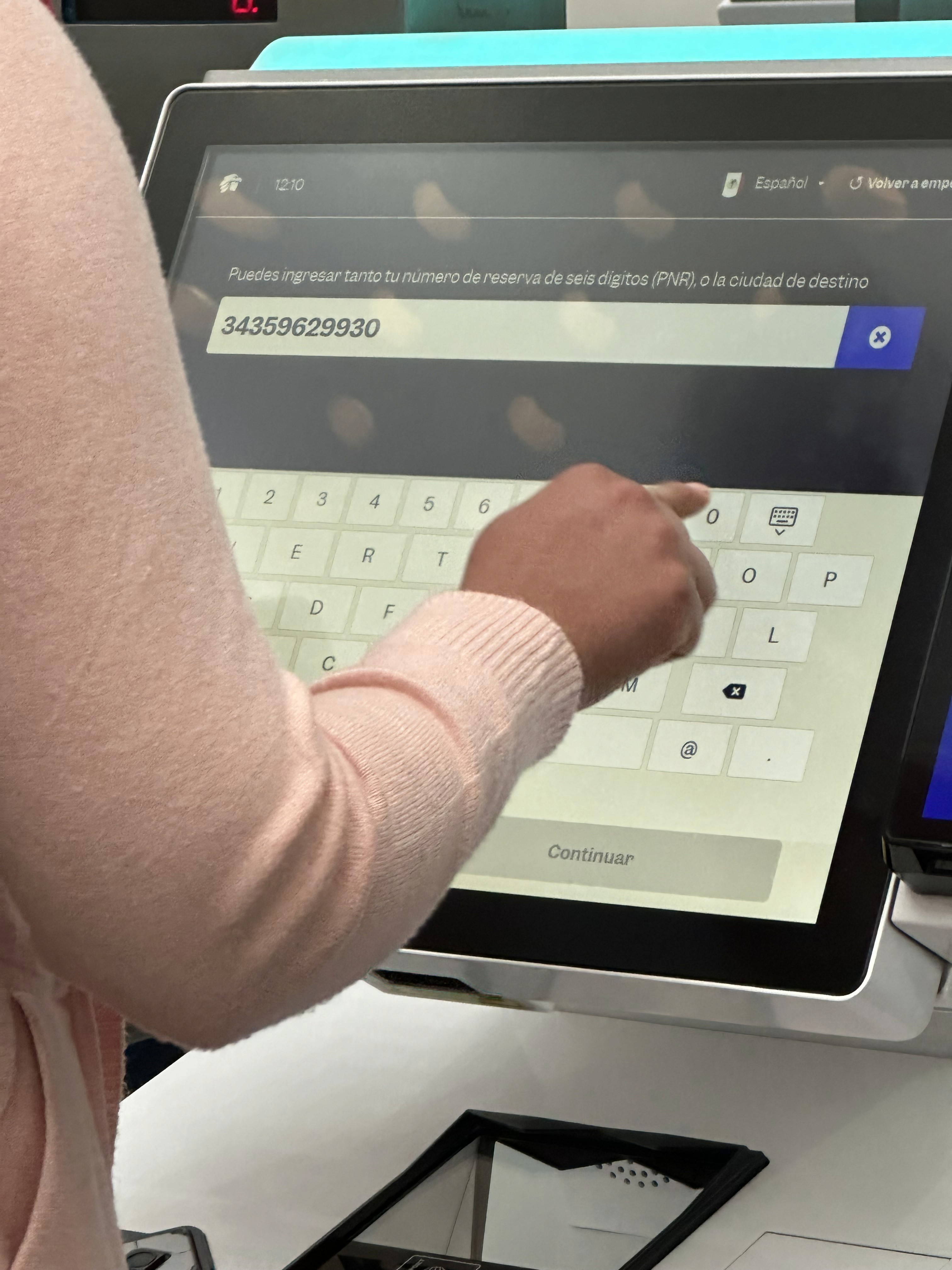
A significant technical constraint came from SABRE, the backend provider managing flight availability and fares. The system couldn't process check-in for more than 5 passengers in a single transaction. The original flow had allowed users to select up to 9 passengers at once creating a backend failure state with no clear error recovery.
Our decision: cap the visible selection UI at 5 passengers per transaction and handle the technical reset silently in the backend. Users completing check-in for larger groups are guided through a second iteration of the same flow without being exposed to the underlying limitation. This kept the experience clean without requiring a SABRE-side change, which was outside our scope and timeline.
Propuesta de valor
Para comprender mejor las prácticas se llevó a cabo un benchmark de diferentes CRMs, y los elementos mínimos necesarios para trabajar en la plataforma como MVP. Los puntos más fuertes que un panel de control tan completo debería tener y que era necesario identificar.
Validación
Validé los requisitos necesarios para iterar, primero un mapa del sitio para mostrar cómo se vería la página con flujo de datos concretos.
Propuesta de valor
¿Quieres decir hola?
Envíame un correo electrónico a natalia.bustosbonfil@gmail.com -
¡Me encantaría saber de ti!
Currículum
📍 Ubicada: México y Internet
©2026 All Rights Reserved