
Aeroméxico redesigning the Airport Kiosk check-in
from 15 Steps to 6
Timeline
July — January 2026
PLATFORM
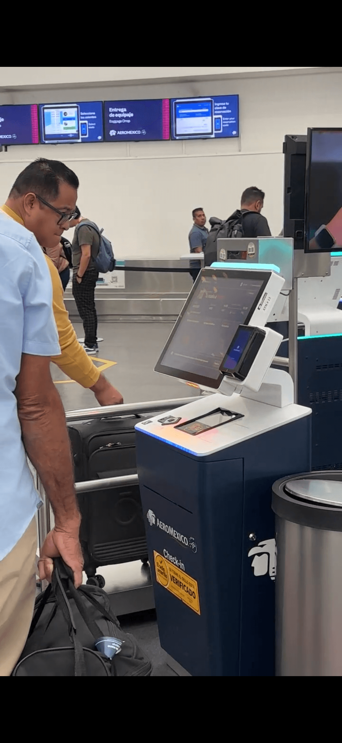
Airport kiosk
(Physical hardware)
MY ROLE
Product Designer
How simplifying the most stressful moment of travel reduced task time by 30% ?
when filling out information and raised passenger satisfaction
About Aeromexico
The check-in kiosk at Aeroméxico airports had 15 steps, an average baggage drop time of 10 minutes, and error messages with no actionable guidance leaving passengers stranded at the worst possible moment of their journey.
After a full customer journey audit spanning Planning, Booking, Check-in and Day of Travel, I was brought in as Product Designer to simplify the core check-in flow: fewer steps, less friction, and a baggage drop experience that passengers could complete in under 2 minutes.
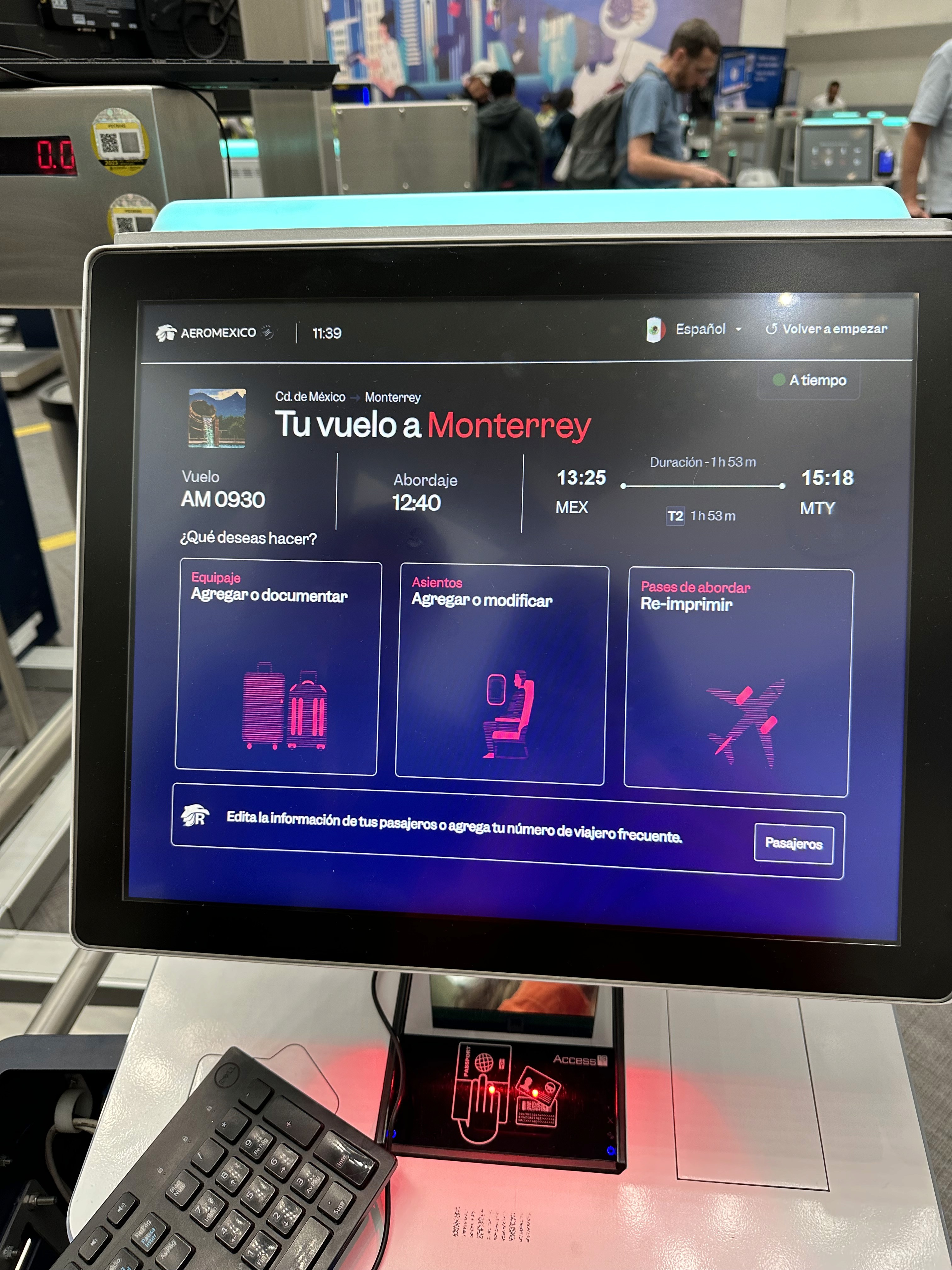
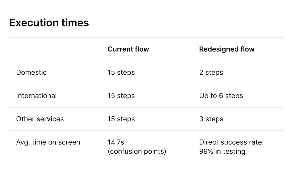
15 → 6 steps
Domestic flow reduced to 2 steps
CES 3.8 → 4.6
Above internal satisfaction bench
-30% TTV
Baggage drop avg
10 min → 7 min
Surpassing Aeroméxico's internal satisfaction benchmark for the first time since the kiosk program launched.
CES increased from 3.8 to 4.6 out of 5
Average baggage drop time went from 10 minutes to 7 minutes, freeing up throughput at peak hours without adding hardware.
TTV dropped 30%
More passengers completed check-in independently at the kiosk, reducing pressure on human agents during boarding windows.
Digital share grew 75%
Designing for a kiosk taught me something I hadn't fully internalized before: the context of use changes everything. The same user who navigates a complex app calmly at home will need literal, explicit instructions on a shared terminal when they're running late for a flight. Stress collapses tolerance for ambiguity. The most important design decision on this project wasn't visual — it was the choice to prioritize clarity simplification over elegance in every instruction screen.
Include users with visual impairments from the first round of research, not as a post-launch iteration. Accessibility considerations surfaced late and required a separate design pass.
Push earlier for a SABRE API update to remove the 5-passenger constraint at the source. The backend workaround works, but it creates invisible technical debt for future iterations.
Define a shared error taxonomy with the engineering team from week one. Generic error messages ("An error occurred") were the most cited pain point in user research — and the last thing we fixed.
What I'd do differently:
Extend the simplified flow to the Aeroméxico mobile app, standardize the experience, applying the same "literal text" principle to the mobile check-in experience.
Explore proactive notifications that pre-fill passenger data before travelers reach the kiosk, reducing the first 2 steps entirely.
What's next
compared to the homepage as we are catering for different use cases.
Research
We benchmarked 18 airlines, spent 48+ hours doing on-site field research at the airport,
and ran usability tests using Maze and guerrilla testing directly at the terminal.
That field time was critical, it revealed 10 edge cases that never appeared
in the existing documented flow.
Including the single biggest pain point: document scanning,
which alone accounted for the majority of user drop-off and confusion.
Key insight that shaped everything
Passengers in transit think in literal text. Under stress, visual metaphors fail, users need exact instructions to feel in control.
This mental model insight drove how we rewrote every instruction screen in the new flow. Less clever, more clear.
Paint Points detected
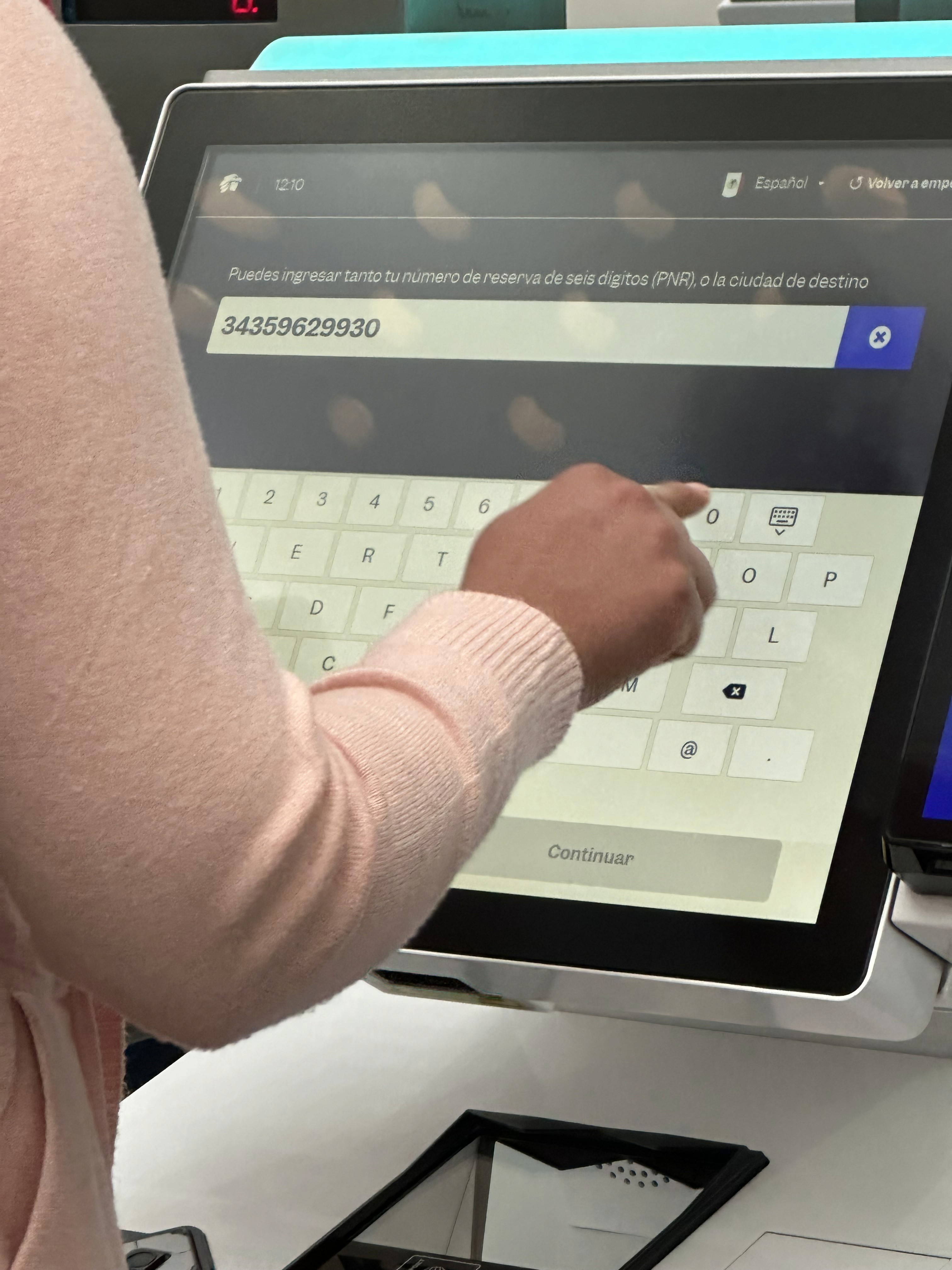
Unclear validations when capturing reservation data.
Long reservation times.
Generic error messages (“An error occurred”) without guidance on what to do.
Why we tackled document scanning first not the full flow
After field research, it became clear that 70% of friction happened during document scanning not during seat selection or fare review.
Rather than redesigning the entire 15-step flow at once, we prioritized that micro-moment first, validated it, and then restructured the surrounding flow around it. This reduced risk and let us ship faster.
The SABRE constraint and the 5 passenger limit.
A significant technical constraint came from SABRE, the backend provider managing flight availability and fares. The system couldn't process check-in for more than 5 passengers in a single transaction. The original flow had allowed users to select up to 9 passengers at once creating a backend failure state with no clear error recovery.
Our decision: cap the visible selection UI at 5 passengers per transaction and handle the technical reset silently in the backend. Users completing check-in for larger groups are guided through a second iteration of the same flow without being exposed to the underlying limitation. This kept the experience clean without requiring a SABRE-side change, which was outside our scope and timeline.
Design process and explorations
Redundant flow for smooth travel.
Based on the findings, we redefined the flow and interaction of the reserve so that it felt linear, predictable, and error-tolerant.
The focus was on reducing steps, standardizing repeated information, bringing forward validations, and keeping progress visible at all times.
Design Process & Key Decisions
This wasn't a standard app redesign.
We were designing for passengers under time pressure,
on shared hardware, often in a noisy environment which meant every decision
had to favor clarity and speed over feature richness.
Impact, Learnings & What's next
Wanna say hey?
Pop me an email at natalia.bustosbonfil@gmail.com -
I’d love to hear from you!
Resume
📍 Currently based: Mexico and The Internet
©2026 All Rights Reserved